
How executives, founders, and senior leaders should approach wardrobe decisions for a headshot that will represent them for years.
The wardrobe question gets asked more than any other before a session. It's also the question most people overthink. The answer is simpler than the available advice suggests, but the simplicity comes from understanding what the photograph is actually doing.
A headshot is a photograph of a person, but a photograph of a person wearing clothes is also a photograph of a decision. The decision communicates before the face does. Viewers register the wardrobe in the first fraction of a second they spend on the image, and that registration sets the frame for everything they read into the face afterward.
This isn't about fashion. It's about signal. The wardrobe is the part of the image you have the most control over, and the part that does the most work establishing what kind of professional the viewer is looking at.
The executives who get this right tend to think about wardrobe the way they think about other high-leverage decisions: get it close to right once, and stop spending energy on it.
Before getting into specifics, three principles that resolve most wardrobe questions before they come up.
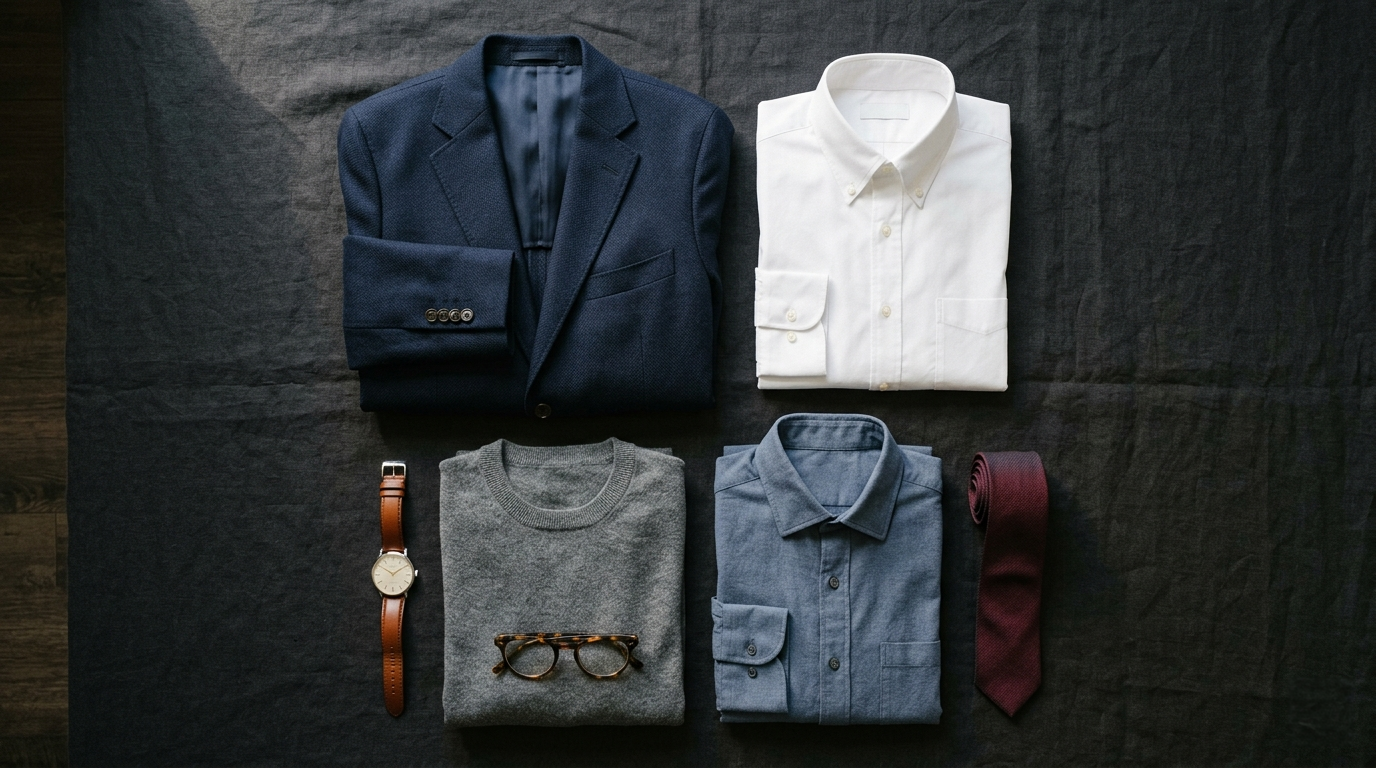
The reason solid colors work isn't that they're safe. It's that they let the photograph do its job.
A solid color provides a clean field that the face reads against. Navy, charcoal, deep jewel tones, and crisp whites all carry information about the person without competing with the person. The viewer's eye moves to the face because the wardrobe isn't asking for attention.
Black is the exception worth knowing about. It can read as confident and intentional, but it can also flatten on camera and merge with darker backgrounds. If you want to wear black, plan the background around it instead of after it.
Patterns aren't off the table, but they require more from the rest of the image to work.
A subtle pattern, a fine windowpane, a tight herringbone, a small-scale check, can add character without overwhelming. The test is whether the pattern reads as texture from six feet away or as a competing visual element. Texture works. Competition doesn't.
Bold patterns, large prints, and high-contrast checks almost always create problems. They moiré on camera. They date the photograph. They become the thing the viewer remembers instead of the person.
If you're not sure, default to solid. You can always add personality through color, fit, or accessories.
The neckline is the bridge between the wardrobe and the face. It frames the lower half of the portrait and quietly sets the tone of the entire image.
A clean collared shirt under a jacket reads as classic professional. An open collar without a jacket reads as approachable but still considered. A turtleneck or mock neck reads as creative or executive depending on the rest of the image. A t-shirt reads as casual, sometimes intentional, often not.
The principle: the neckline should match the level of formality you want the photograph to communicate, and it should be cleaned up. A wrinkled collar or a stretched neckline undoes everything else.
A second layer, a jacket, blazer, or structured cardigan, adds dimension and authority to a headshot in a way a single layer can't.
The reason is partly structural. A jacket gives the shoulders shape and the frame architecture. It creates a clear visual hierarchy from collar to lapel to face. Without it, the upper body reads flatter and the eye has fewer places to land before reaching the face.
It's also partly psychological. A jacket signals intention. It tells the viewer the person dressed for this, which makes the entire image feel more considered.
You don't always need a jacket. But if you're senior enough to be asking what to wear, you're senior enough to benefit from one.
A short list of things that consistently cause problems:
A short list to run through the morning of the session:
The wardrobe should support the photograph. When it stops supporting and starts competing, the photograph stops working.
A professional headshot is worn longer than most people expect. The image ends up on a LinkedIn profile, a company page, a press mention, a speaking engagement, a board bio. It becomes the visual shorthand for the person across every place they appear professionally.
Getting the wardrobe right means the photograph holds up across all of those uses. Getting it wrong means a session that has to be redone, or worse, an image that quietly underrepresents the person for years.
The wardrobe decision is small in the moment and large over time. It's worth the hour of thought to get it right.
The before/afters on the homepage make the argument better than any article can. When you're ready, pricing and availability are one click away.